A beautiful front door sets the tone before you even step inside. It’s the first hint of personality, warmth, and intention. The right color makes it feel like you. Whether you’re craving something bold, soft, or somewhere in between, these front door colors offer charm without trying too hard.
Here’s a mix of classic hues and unexpected favorites that work with all kinds of homes. Think sun-washed cottages, clean-lined modern spaces, and everything in between.
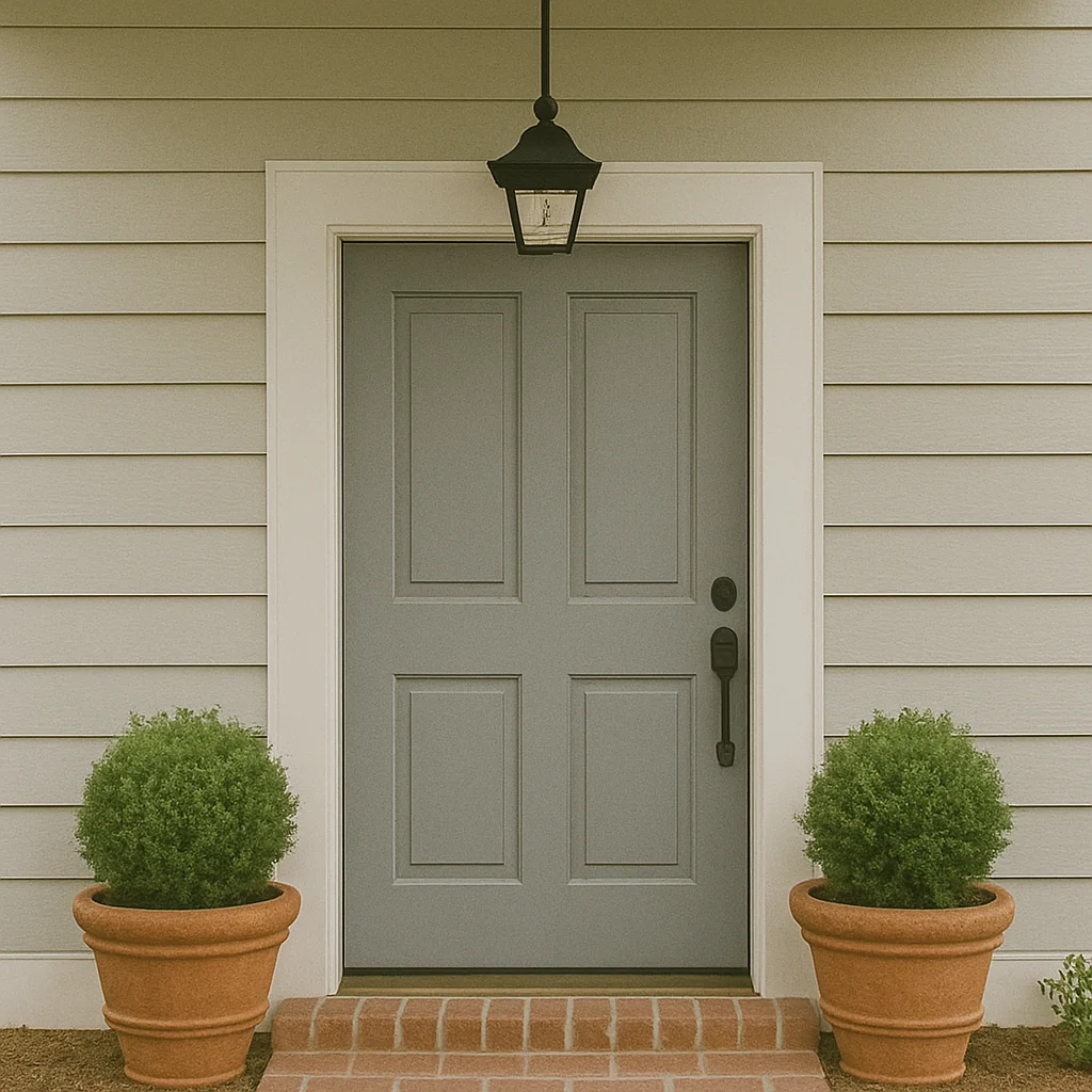
1. Soft Black
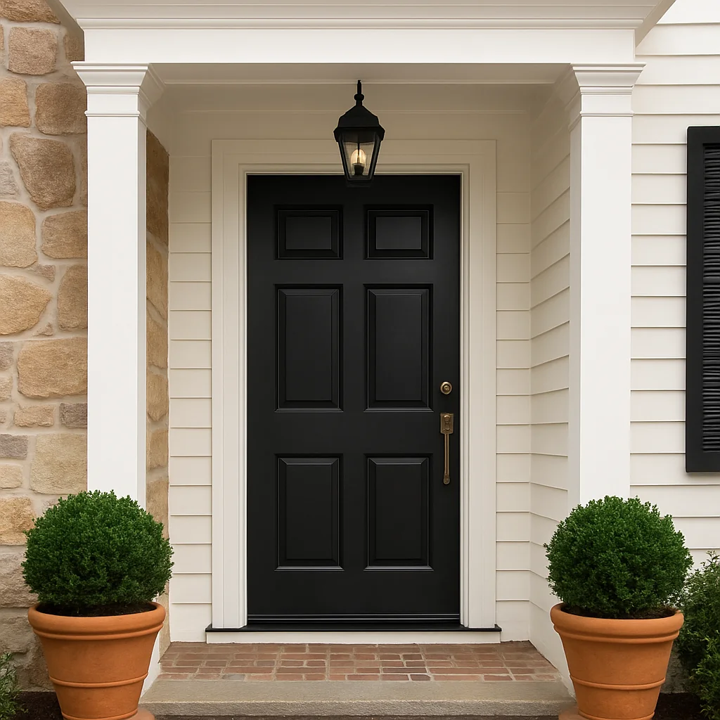
Not harsh, not flat. Just that perfect soft charcoal that adds contrast without overwhelming. A black front door always feels composed, especially paired with crisp white trim, warm stone, or natural wood siding.
2. Sage Green
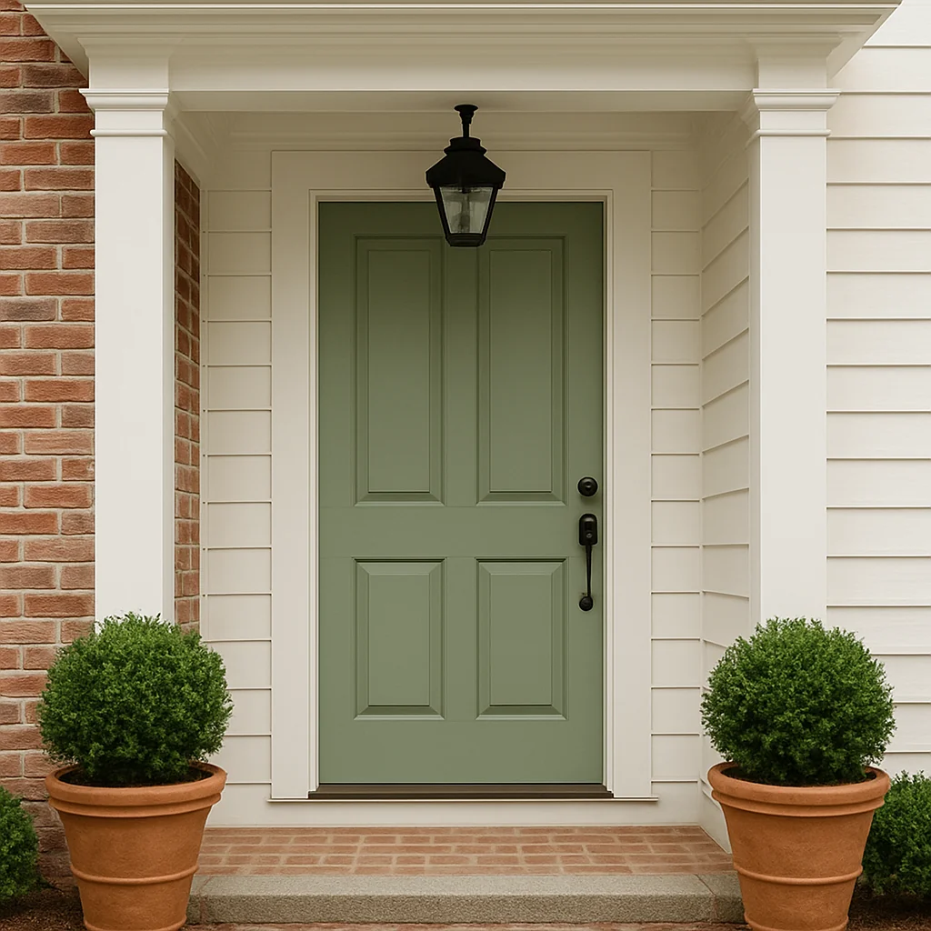
This muted, earthy green has become a quiet favorite. It blends beautifully with garden views, aged brick, or a whitewashed exterior. There’s something grounding about it. Fresh without being showy.
3. Dusty Blue
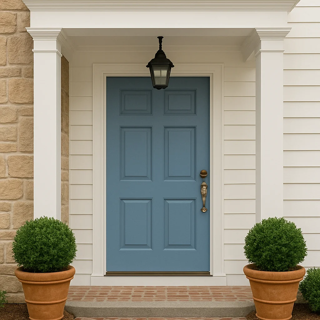
A powdery blue with a hint of gray softens the entry without losing personality. It’s lovely with aged copper hardware or brushed brass. Think misty coastal mornings, even if you’re nowhere near the water.
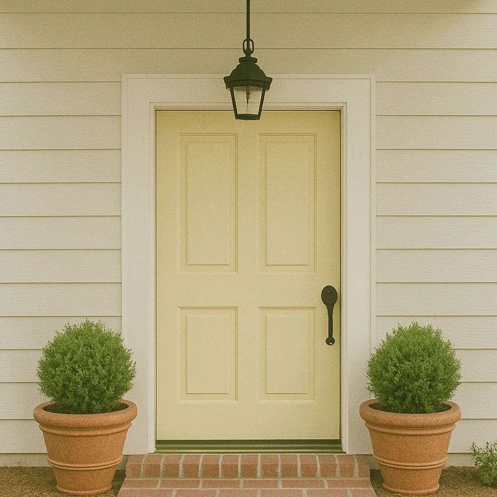
4. Buttery Yellow
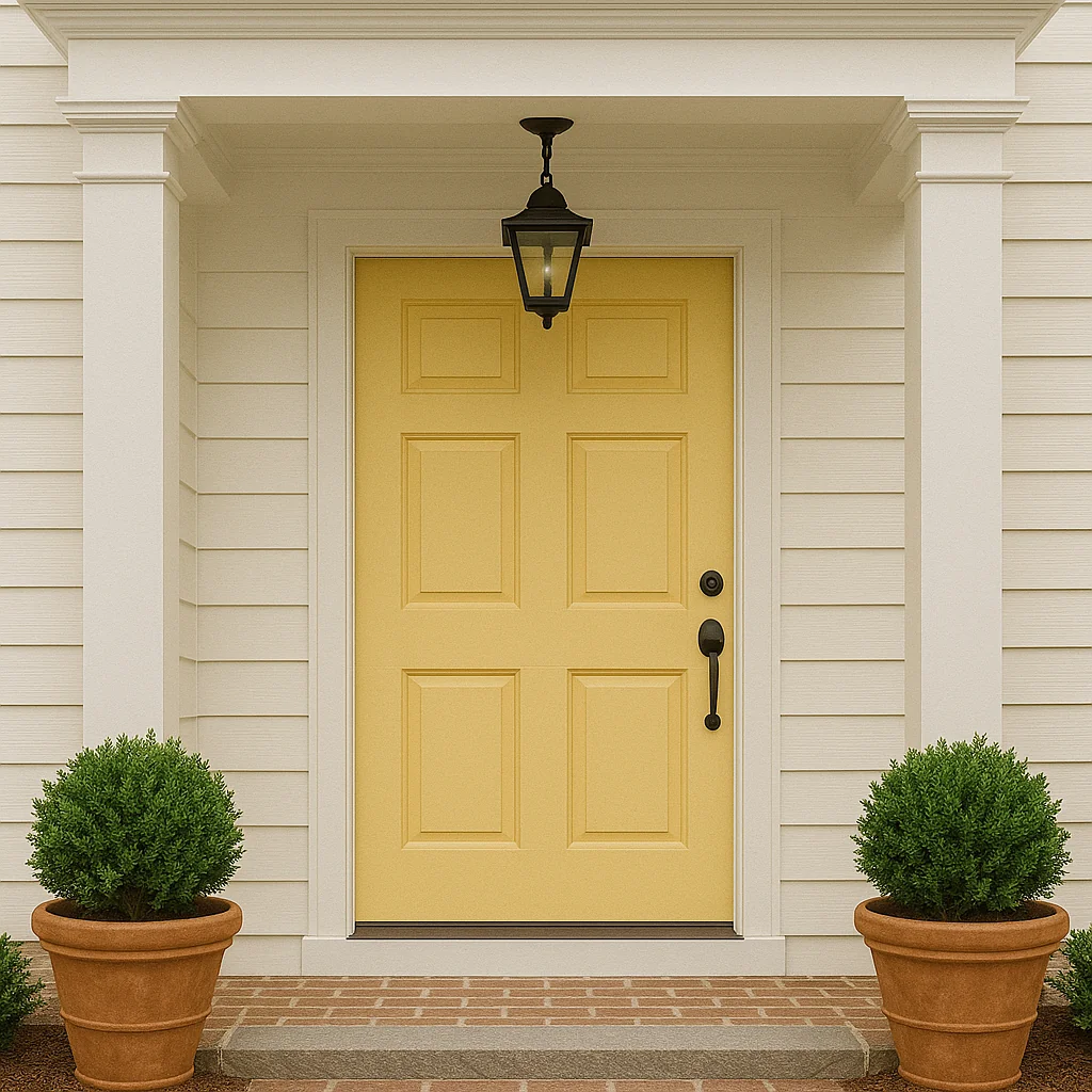
Warm, gentle, and surprisingly easy to live with. A buttery yellow front door adds just enough cheer, especially against soft neutrals or classic clapboard siding. Not loud. Just sunny in the nicest way.
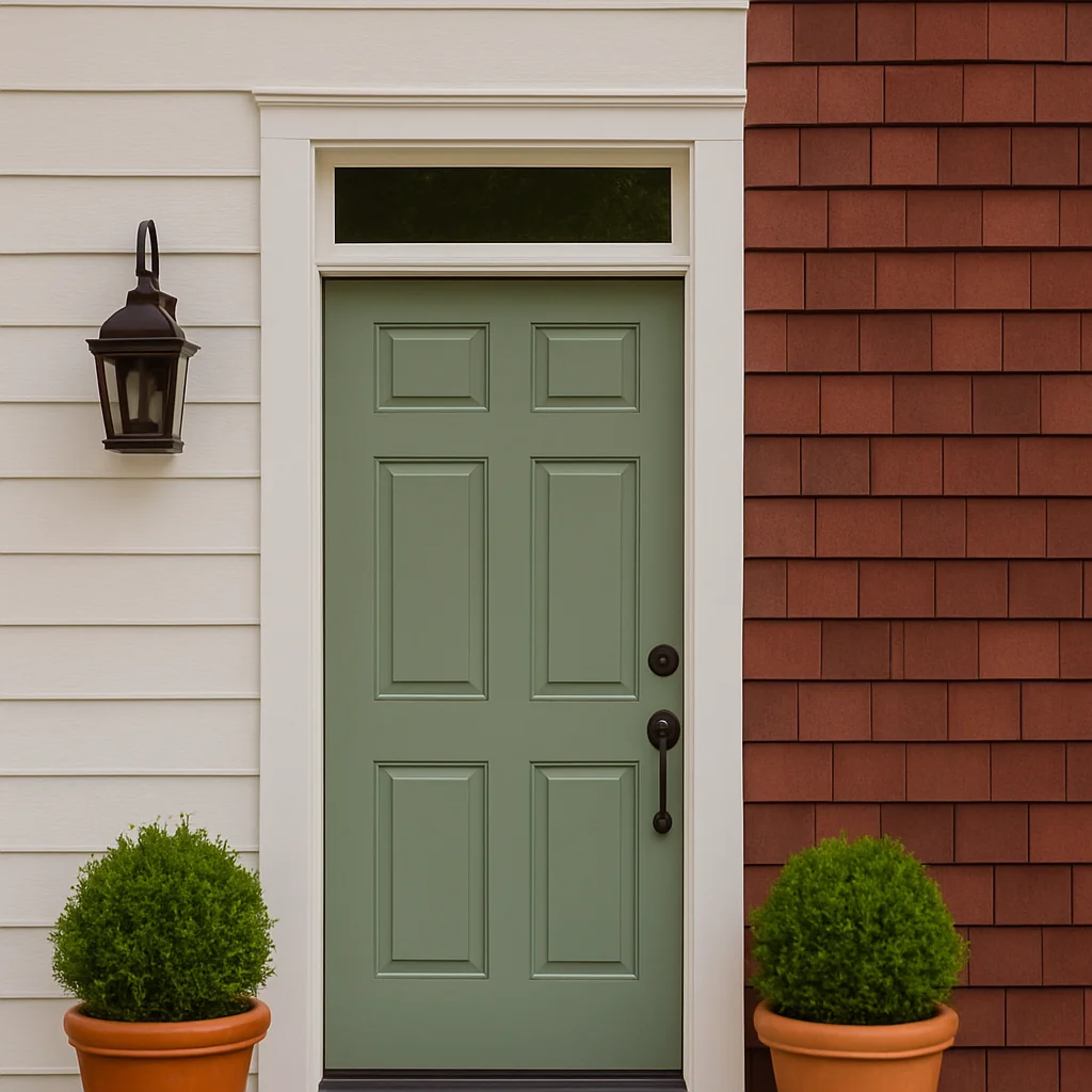
5. Olive Green
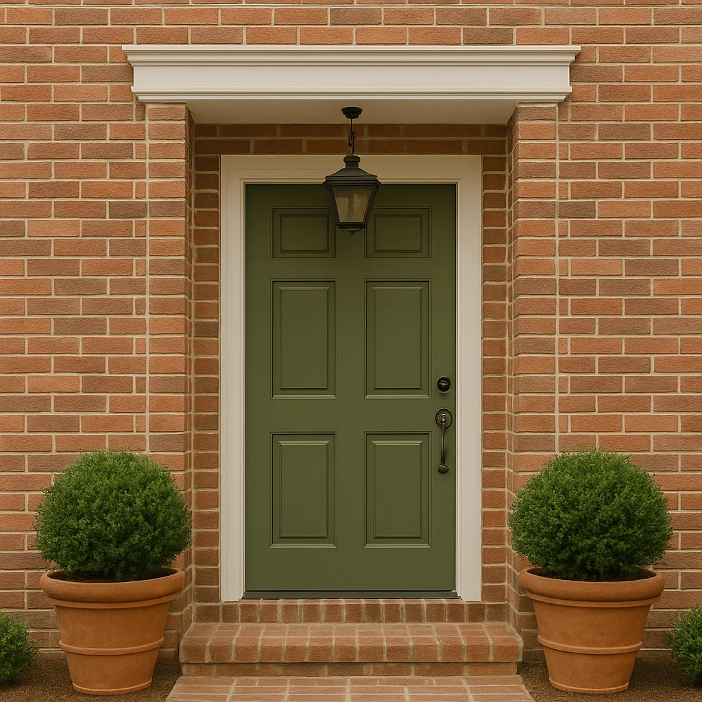
Deep and savory, olive green adds character without shouting. It works especially well with brick, beige, or stone exteriors. It’s a color that feels lived-in and thoughtful.
6. Navy Blue
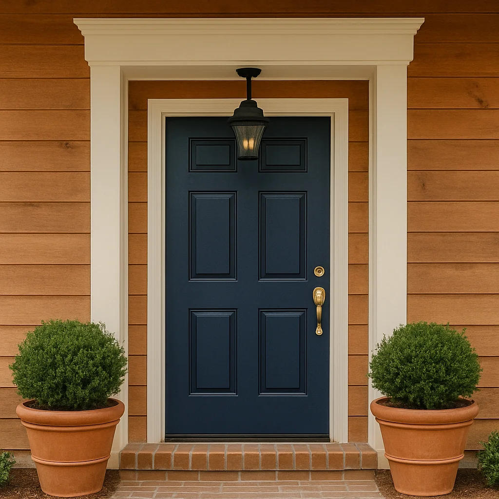
A timeless choice that still feels modern. Navy works with everything. Pale gray, red brick, warm wood. Add matte black hardware for a crisp look or softened brass for something a bit richer.
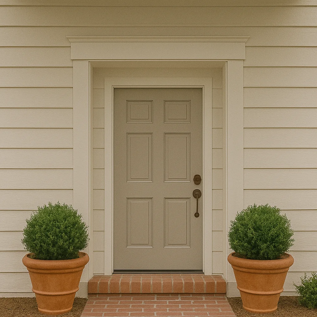
7. Warm Taupe
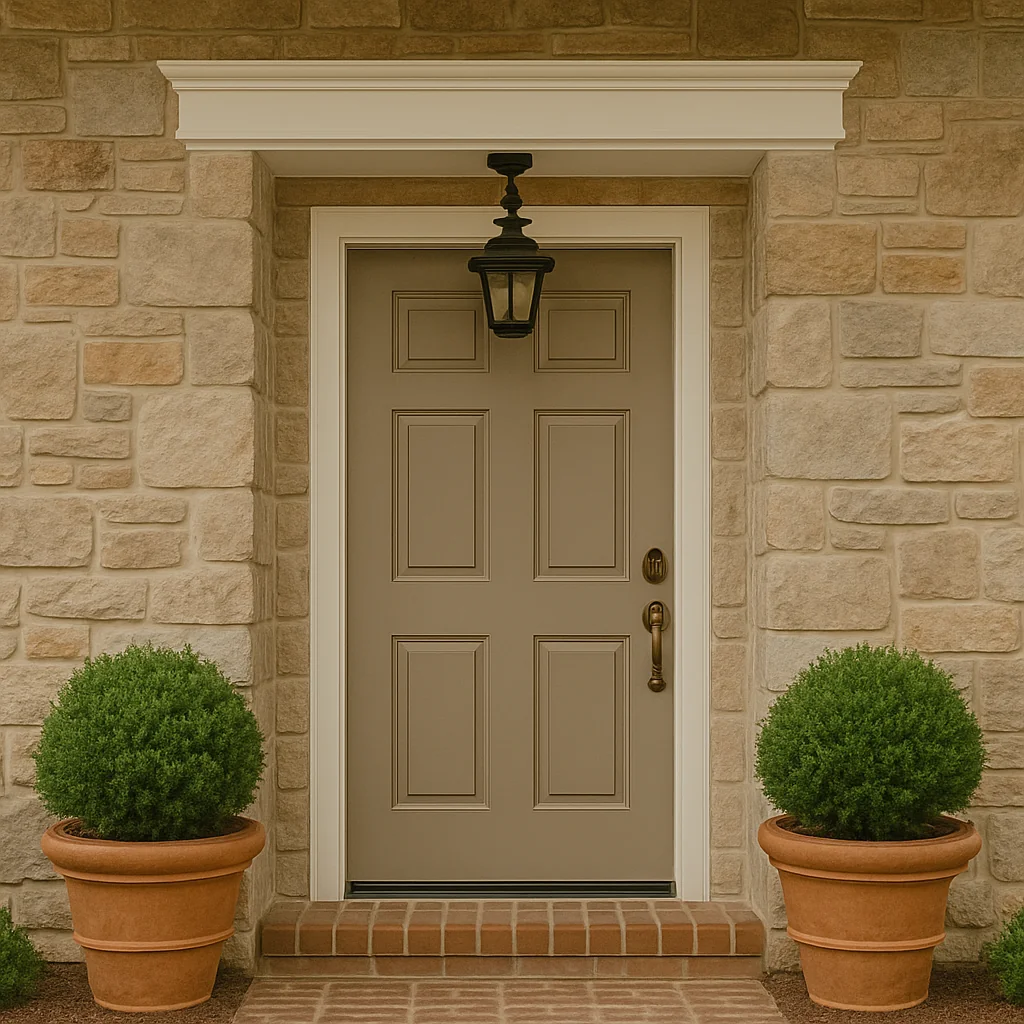
Somewhere between stone and mushroom, warm taupe is a cozy neutral that brings out the best in natural textures. It’s subtle, elegant, and plays nicely with both cool and warm palettes.
8. Coral
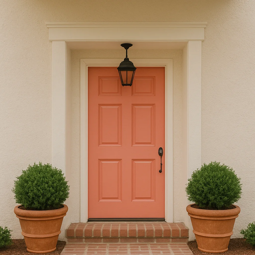
A slightly unexpected pop of color. Soft coral makes a front door feel joyful without tipping into “statement” territory. It’s especially striking against white, sandy stucco, or charcoal-gray siding.
9. Soft White
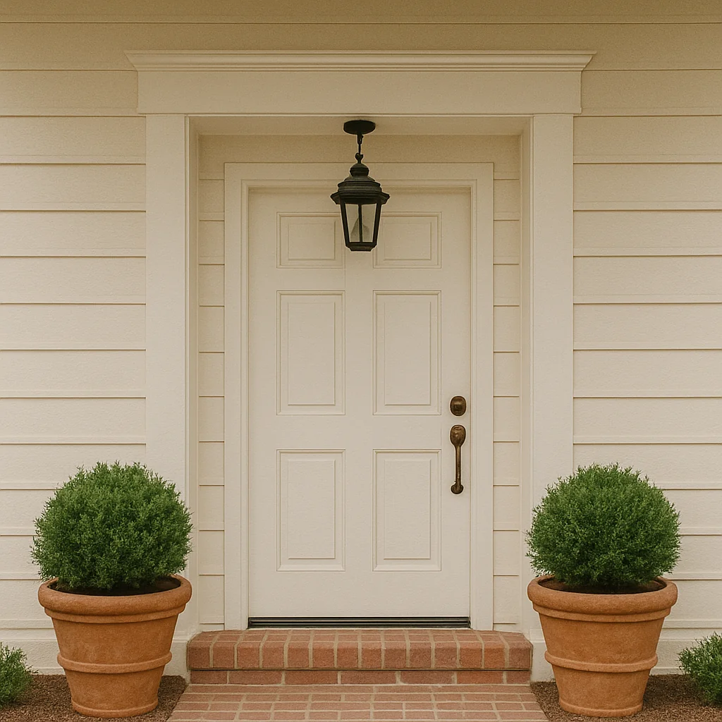
Sometimes the quietest option makes the most impact. A soft white door on a light facade creates a seamless, airy look. Add in aged bronze hardware to keep it grounded and textured.
10. Brick Red
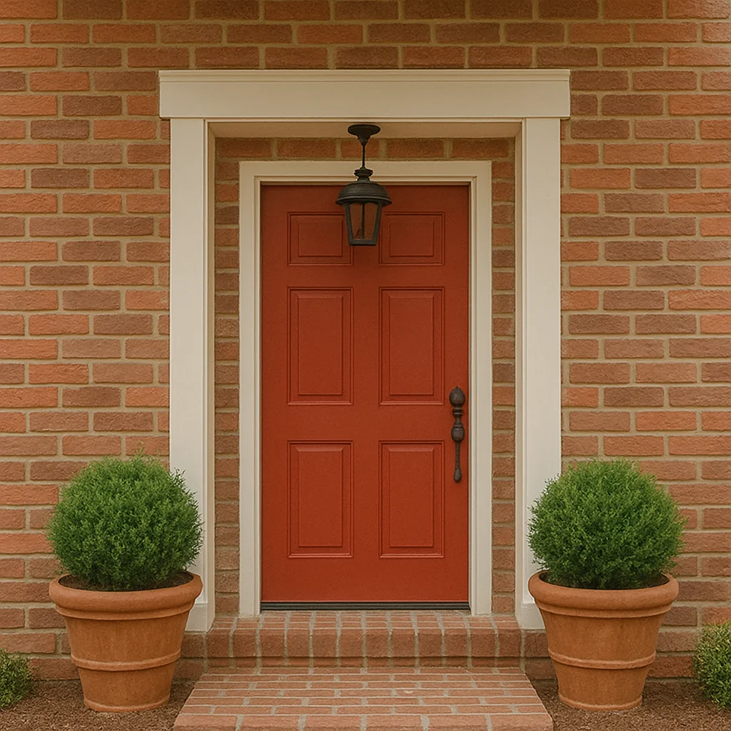
Rich and warm, brick red adds instant charm. It’s especially good on older homes. It feels timeless, especially with aged wood shutters or a climbing vine nearby. Like something out of a storybook, but not too sweet.
11. Deep Teal
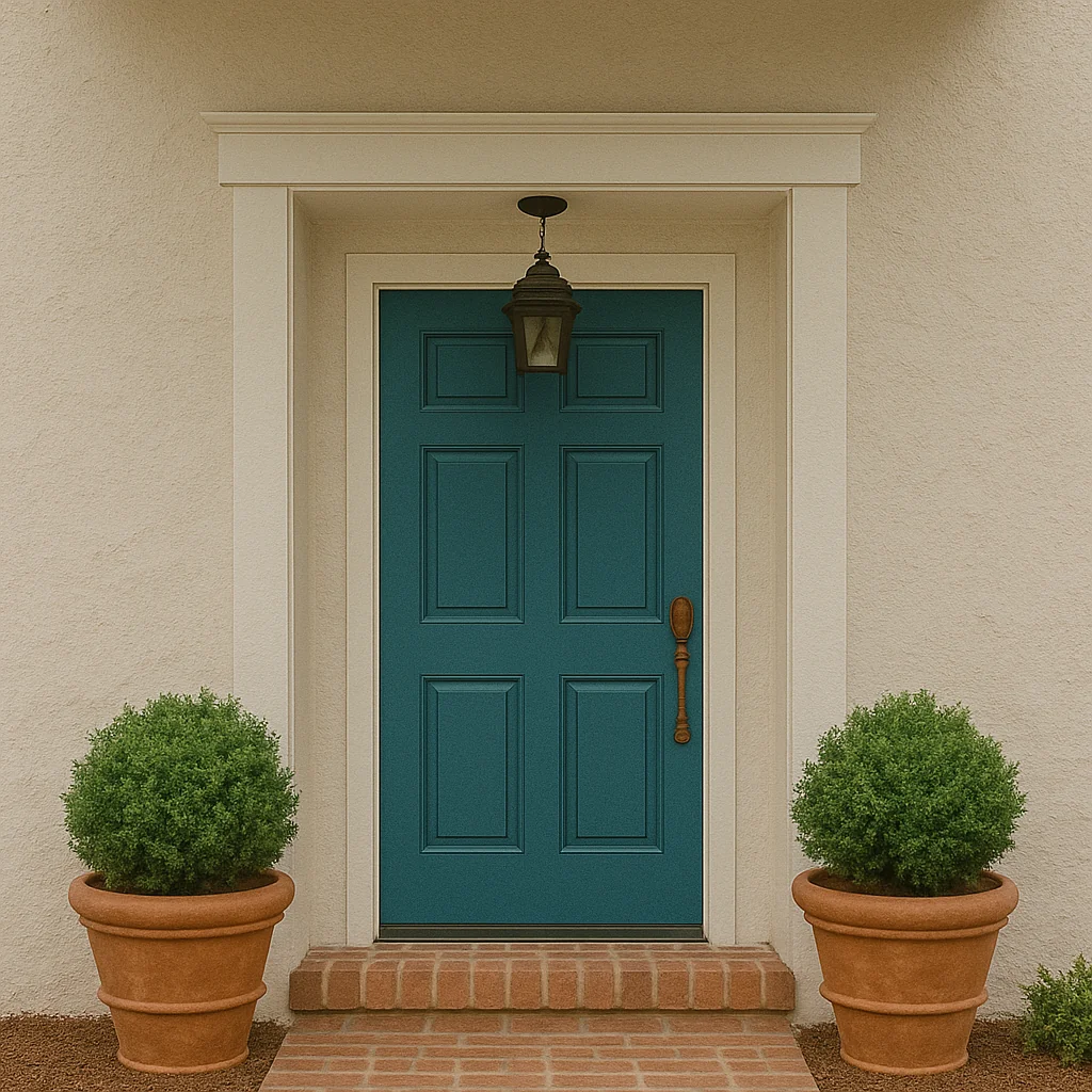
Part green, part blue. Deep teal brings depth and a hint of drama. It pairs beautifully with warm metals, textured concrete, or raw wood beams. It’s bold, but not brash.
12. Greige
That perfect blend of gray and beige makes for a soft, calming entry. Greige works with just about everything and feels especially polished on more minimalist homes.
13. Plum
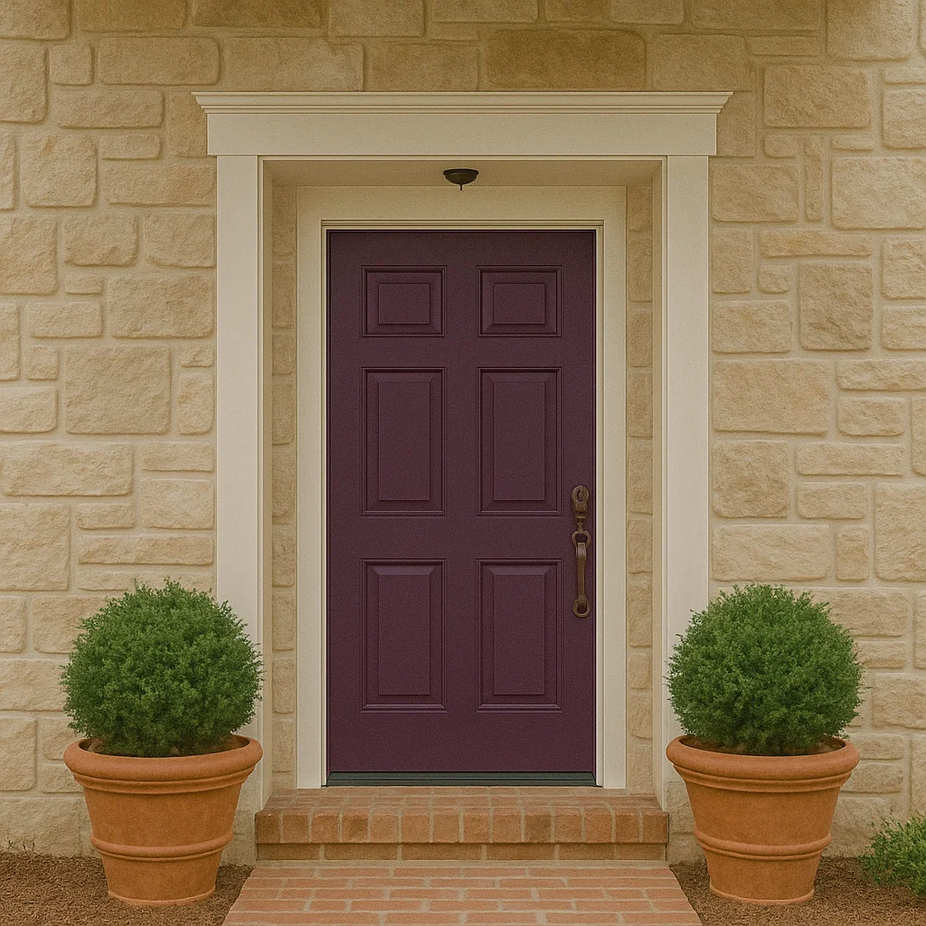
A deep plum front door is unexpected in the best way. It’s moody without being gothic, and it takes on a soft glow in afternoon light. Gorgeous with soft creams or warm stone exteriors.
14. Pale Pink
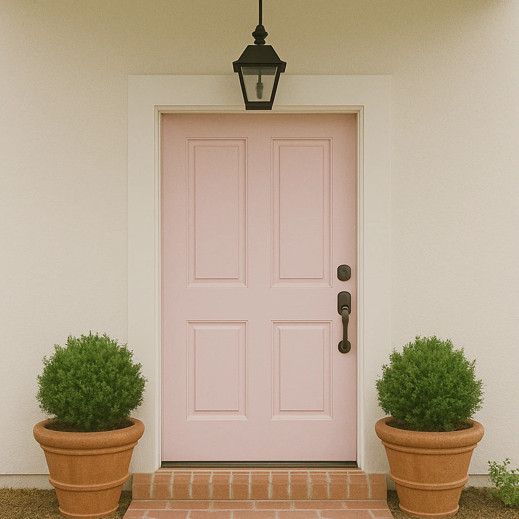
Yes, pink. But softened with gray undertones so it doesn’t feel precious. Pale pink looks unexpectedly sophisticated, especially with deep bronze hardware or minimalist lines.
15. Charcoal Gray
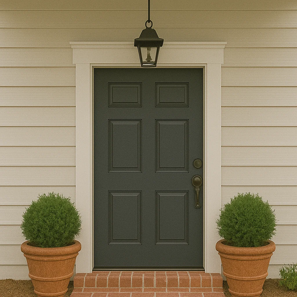
Not quite black, not quite silver. Charcoal gray is endlessly versatile. It adds contrast without heaviness and works with both traditional and modern styles.
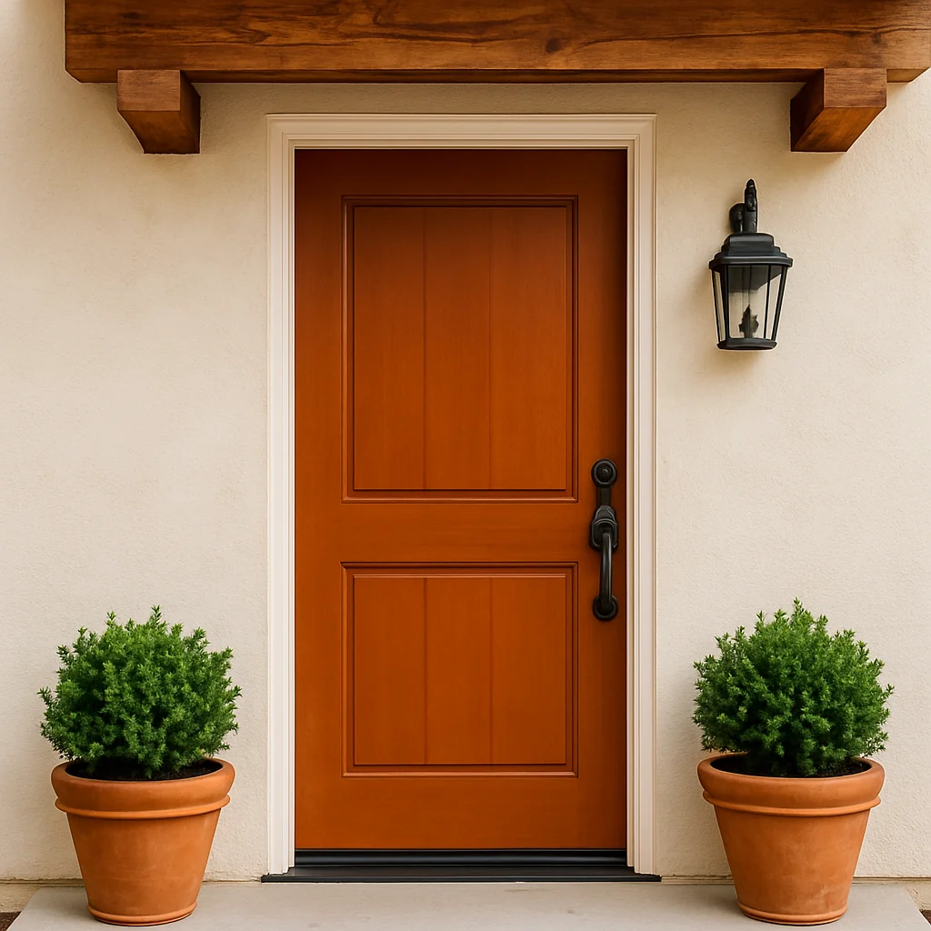
16. Terracotta
Warm, earthy, and rich in texture. Terracotta doors feel rooted and cozy. Especially lovely on stucco or paired with creamy whites and olive greens.
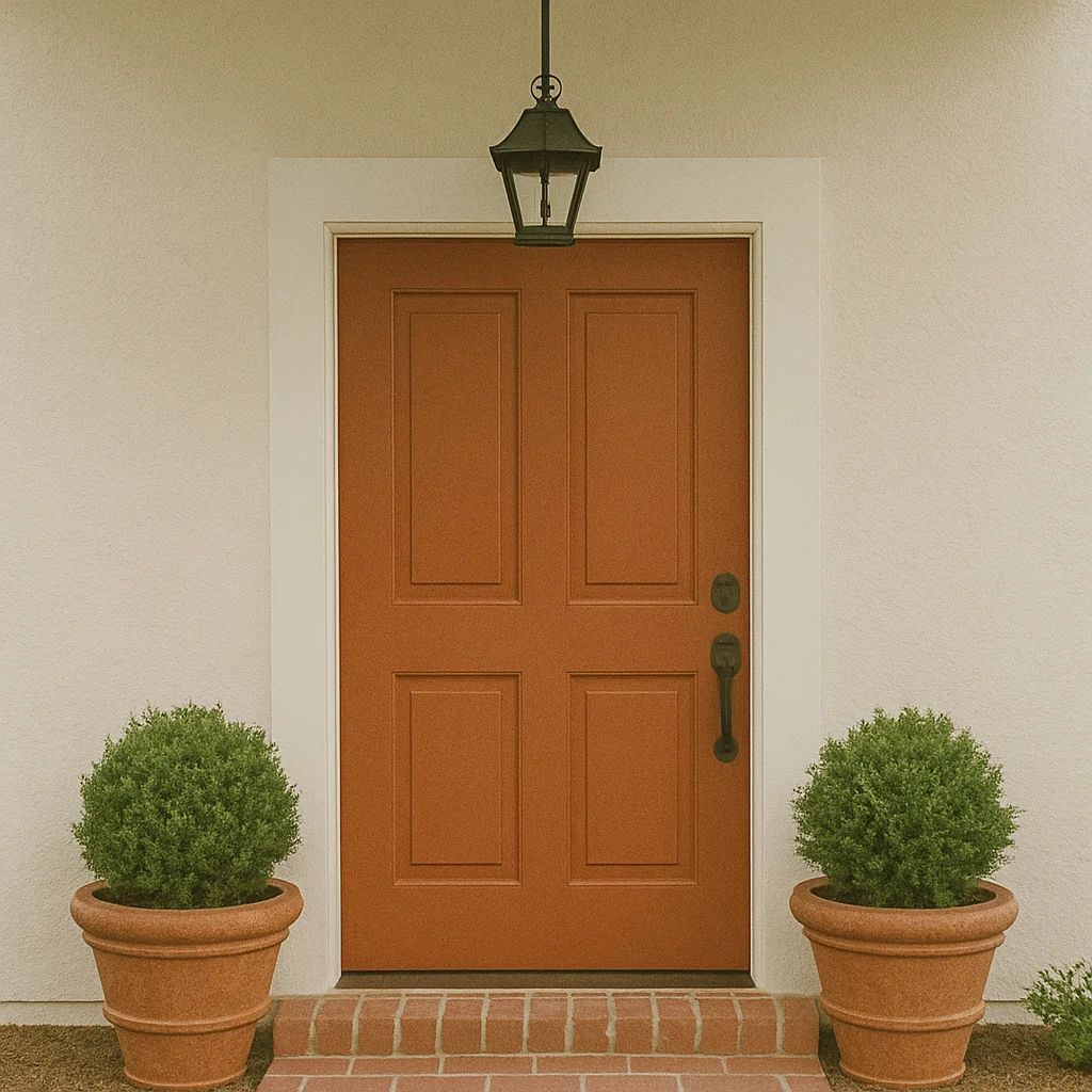
17. Burnt Orange
Not neon, not too bright. Just that warm, rusty tone that feels like late autumn leaves. Burnt orange pairs beautifully with creamy exteriors, raw wood beams, or deep green landscapes. It has personality without shouting.
18. Classic Gray
A clean, balanced mid-gray always works. Especially lovely with white trim or darker siding, it gives a soft sense of order. Add satin nickel or matte black hardware for a modern finish.
19. Lemon Cream
Lighter and creamier than traditional yellow. This shade brings a soft glow to the front of the house. A nice in-between for those who want warmth without too much brightness.
20. Pale Lavender
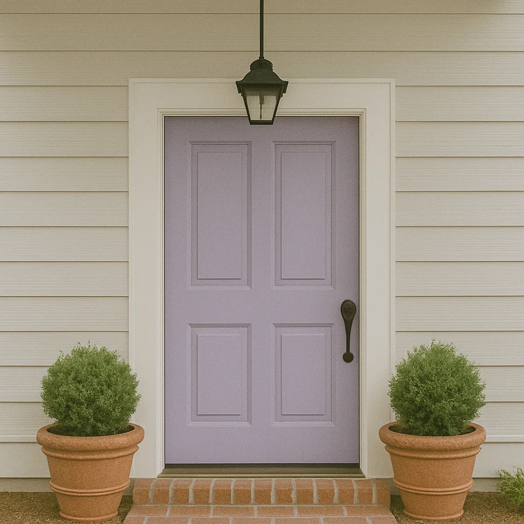
Not bright purple. More of a misty, gray-washed lavender that softens in the light. Surprisingly versatile, it adds a touch of whimsy without being overly sweet.