There’s nothing quite like walking into a room and feeling that ahhh moment. You know the one — when the colors, textures, and lighting just work. It feels calm, stylish, lived-in, but not cluttered. That’s no accident. Often, it’s the quiet magic of the 60-30-10 color rule doing the heavy lifting behind the scenes.
If you’ve ever stared at a paint swatch or stood frozen in the throw pillow aisle wondering why your space still feels “off,” this little rule might be your new best friend. It’s simple, it’s smart, and once you start using it, you’ll never unsee it.
Let’s break it down and make it feel doable — even if you’ve got toddlers, a small budget, or a rental you can’t paint.
What Is the 60-30-10 Color Rule?
At its heart, the 60-30-10 color rule is about balance. It’s a classic design principle that helps you layer color like a pro — no art degree needed.
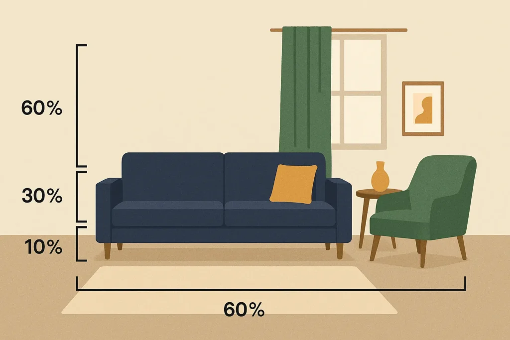
Here’s how it works:
- 60% of the room is your main color (walls, big furniture, rugs).
- 30% is your secondary color (accent chairs, curtains, bedding).
- 10% is your pop color (throw pillows, artwork, that quirky vase you couldn’t resist at the flea market).
It’s kind of like building an outfit: jeans (60), a sweater (30), and a bold necklace (10). You want harmony, but also contrast. A little “oomph.”
And while it sounds formulaic, the beauty is that it works for any style — from Scandinavian neutrals to boho jewel tones to minimalist Japandi. It gives you just enough structure to avoid decision fatigue, without sucking the soul out of your space.
Why This Rule Works
Designers love it for a reason. But here’s why you will too — even if you’re working with a rental, a tight budget, or a chaotic playroom.
- It keeps rooms from feeling flat. A single color can make a space feel sterile or overwhelming. This rule adds dimension and movement.
- It prevents color overwhelm. You don’t have to choose seven colors. You just need three — and a plan.
- It flexes with real life. Can’t repaint right now? No problem. You can shift color percentages with textiles, art, and accessories.
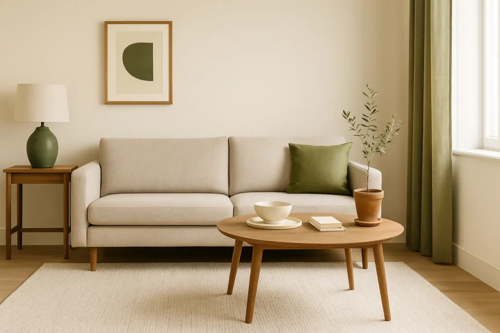
I used it in our living room after repainting felt too expensive. I kept our greige walls (60), added forest green velvet curtains and a secondhand armchair (30), and then brought in mustard yellow throw pillows, books, and a ceramic lamp (10). It made everything feel intentional — without buying new furniture or touching a paintbrush.
How to Choose Your 60-30-10 Colors
Choosing the right color trio can feel like a commitment, especially if you’re not sure where to start. Here’s how to take the pressure off:
1. Start With What You Already Own
Look at your space and ask: What’s already dominating visually? If your walls are white or beige, congrats — you’ve got your 60%. That gives you room to play elsewhere.
2. Use Nature as Your Guide
Not sure which colors go together? Look outside. A soft green (leaves), warm brown (tree bark), and terracotta (clay) make a rich, earthy combo. Or try sky blue, pale sand, and coral pink for a beachy feel.
3. Think in Mood, Not Just Color
Ask yourself: How do I want this room to feel?
- Calm → Muted, tonal palettes (think sage, oatmeal, soft blues)
- Energetic → High-contrast brights (navy, mustard, coral)
- Cozy → Warm neutrals with soft accents (mocha, rust, cream)
Color Combo Examples
Here are some combos that work beautifully — and can flex for different styles:
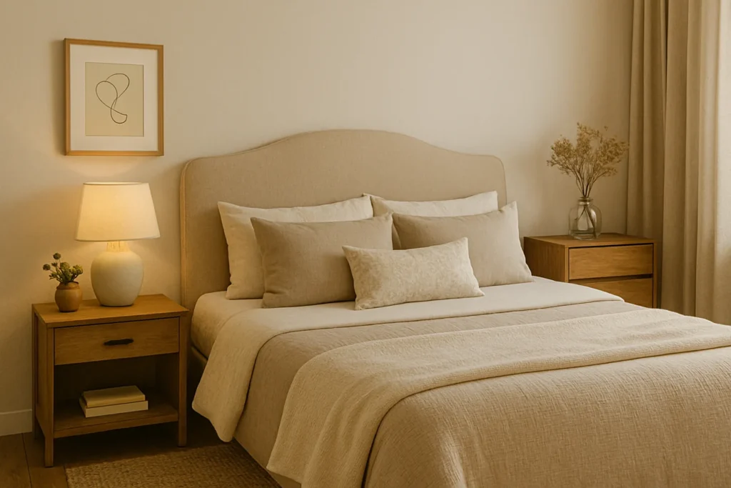
Neutral But Not Boring
- 60%: Warm white walls
- 30%: Soft greige or clay-toned upholstery
- 10%: Olive green or deep navy accents
Moody & Sophisticated
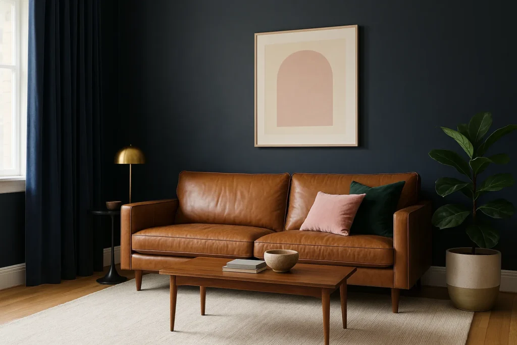
- 60%: Charcoal or navy walls
- 30%: Cognac leather or brass accents
- 10%: Blush pink or emerald green touches
Earthy & Organic
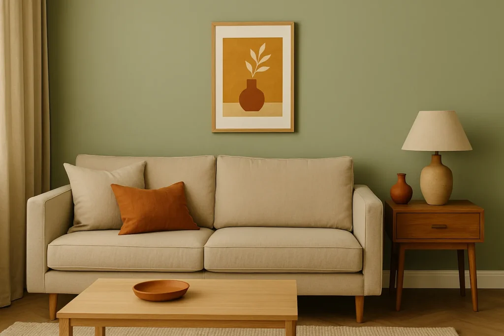
- 60%: Sage green or taupe walls
- 30%: Linen beige textiles
- 10%: Terracotta or ochre pops (a thrifted vase, framed art, pillow covers)
Playful & Bold
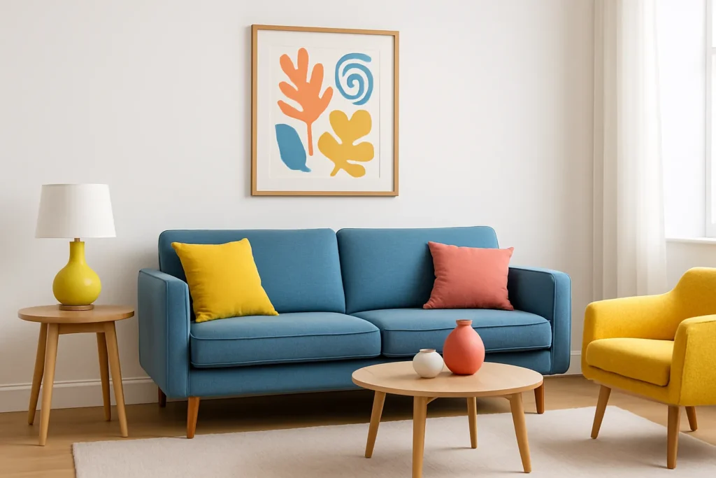
- 60%: Crisp white or pale gray walls
- 30%: Sky blue or soft teal furniture
- 10%: Sunflower yellow or coral details (even a quirky print on the wall)
And remember: your 10% pop doesn’t have to be bright. It just has to contrast enough to stand out. A soft blush can be your “pop” in a deep-toned room. A charcoal gray can pop in an all-white space.
How to Adjust the Rule for Small Spaces
If you’re working with a tiny apartment or just love color (guilty!), you can still use the 60-30-10 color rule — just bend it a bit.
- In small spaces, lighter main colors (whites, creams) help open things up, while darker secondary and accent colors add coziness without crowding.
- For maximalists, consider layering patterns in your secondary and accent colors. As long as your main 60% stays relatively calm, you can have fun with florals, stripes, or even checkerboard floors.
This rule is a framework — not a fence. Once you understand it, you can break it beautifully.
Final Tips
- Don’t overthink the math. Eyeball it. Nobody’s measuring your curtains with a calculator.
- Think in layers. You can build your 30% and 10% over time — it doesn’t have to happen in one weekend.
- Seasonal swaps can shift the balance. In summer, maybe your throw blanket becomes your pop color. In fall, it might be that rust-colored candle.
The Cozy Takeaway
Using the 60-30-10 color rule doesn’t mean your home has to look like a showroom. It means it looks like you — just a slightly more pulled-together version.
It’s a little structure, a little freedom, and a lot of personal style. And once you see how good your space can feel with the right color balance? You might just find yourself actually enjoying decorating again.